Radiant as a brand
Before we had a clear understanding of what our design language was supposed to be, we went through tons of concept designs for the logo—and believe it or not, it was one of the most painful experiences I've had during my entire time working on this project. The main reason was that I didn't have a solid branding mission to work with for quite a while, especially after the product direction kept shifting. So we had to draft a lot of different concepts, exploring whether the logo should reflect the product itself or lean more into the narrative side of things.
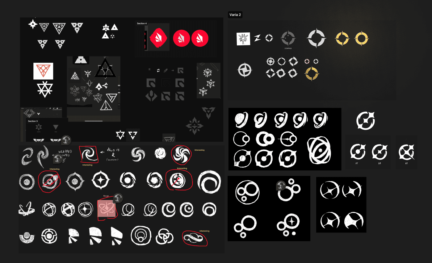
After really pushing the boundaries of how we approached Radiant as an app, we began exploring key shapes that could represent its core abstractions. Radiant needs to communicate through narrative—and also reflect what it stands for. We explored a range of shapes to help convey that, and eventually narrowed down our options. Once we received approval from stakeholders, we were able to start shaping the design language for the UI. However, given the limited time, it was impossible to fully extend the style we envisioned across every part of the app. With branding, design system revamp, and feature design all happening in parallel over a 2–3 month span… it was chaotic.
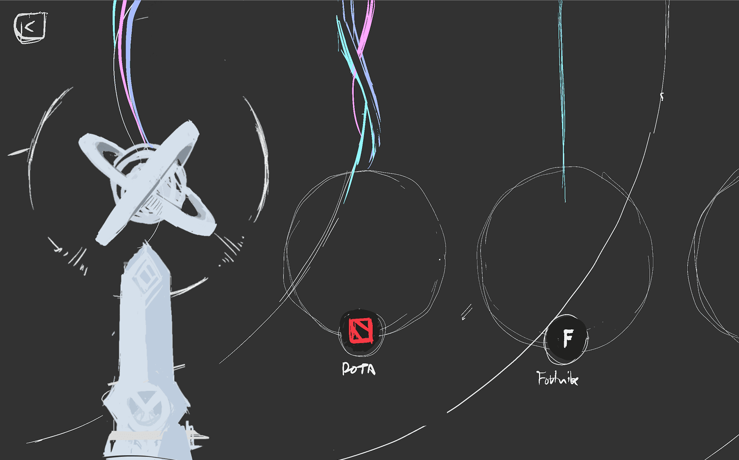
When we started exploring the UI, we kicked things off with tons and tons of sketches. At the time, I felt it was the right approach to push the UI toward something more game-like. I clearly remember having four different UI concept styles that I walked through with my director—but even then, we couldn't quite decide which one truly captured the essence of Radiant.
Shaping a Design System
Building our design system was never about merely assembling a library of buttons and form fields—it was about architecting a visual language that feels native to our product's unique aesthetic and user experience. Unlike traditional app UIs that rely heavily on standardized usability guidelines and minimalist patterns, our interface lives at the intersection of functionality and immersion. This required us to approach the design system with a mindset that balances both visual storytelling and interactive clarity.

The main challenge was knowing from the start that we didn't have enough time to create a proper design guideline for other designers to follow since by the time we got direction settled from stakeholders and also especially from art side. This led me to plan things a bit ahead on how we should approach the design process and how we can ensure that all features that are being work on by other designers will follow the same design patterns.
What we did was develop the skeleton components—simple, foundational pieces that could be used consistently across the app. These were designed in a way that allowed us to update them later, and once everything was properly staged, it worked well. Especially on the development side, where updates needed to roll out all at once, it helped that we designers were already aligned on the upcoming changes.
One big lesson I learned was to never implement final designs directly on the staging site too early—because things will always change. I've come to see the process of going from low-fi to hi-fi in staging as something that actually benefits development. It gives us a real environment to test things, similar to how game development works.
In the end, we decided to focus on key UI elements that could be developed in a way that was minimal enough to maintain as a UI design system. From there, we'd be able to introduce stronger patterns and design elements into the system once we had more time.
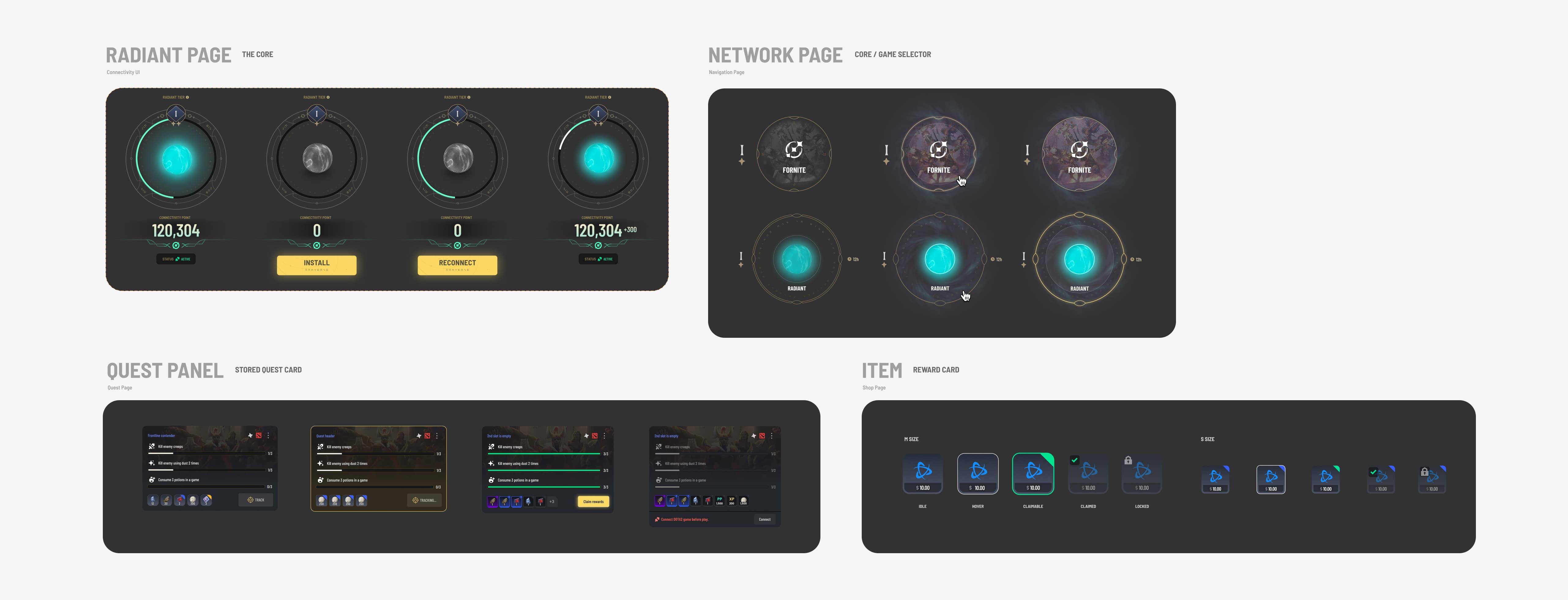
The process began with aligning on clear requirements. We held collaborative sessions with game designers, UX strategists, and product leads to identify the core building blocks of our interface—from modular HUD elements and interactive panels to layered navigation patterns and stylized pop-ups. These workshops allowed us to define not just what needed to be built, but why—ensuring every component had a clear purpose tied to gameplay or user behavior.
In parallel, we conducted internal design testing to validate whether each UI component was intuitive, legible, and functional in context. These quick iterative tests helped surface usability issues early. We also practiced regular peer reviews within the design team, allowing us to critique each other's work and align on design patterns, visual consistency, and interaction logic before pushing components forward into implementation.
Defining and Evolving Our Visual Language
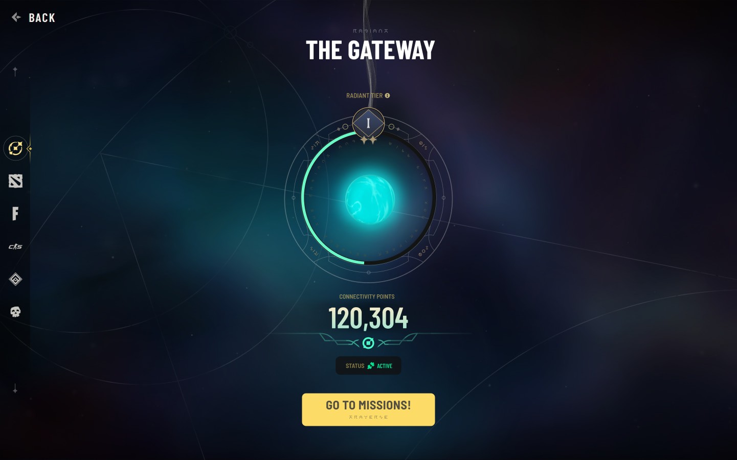
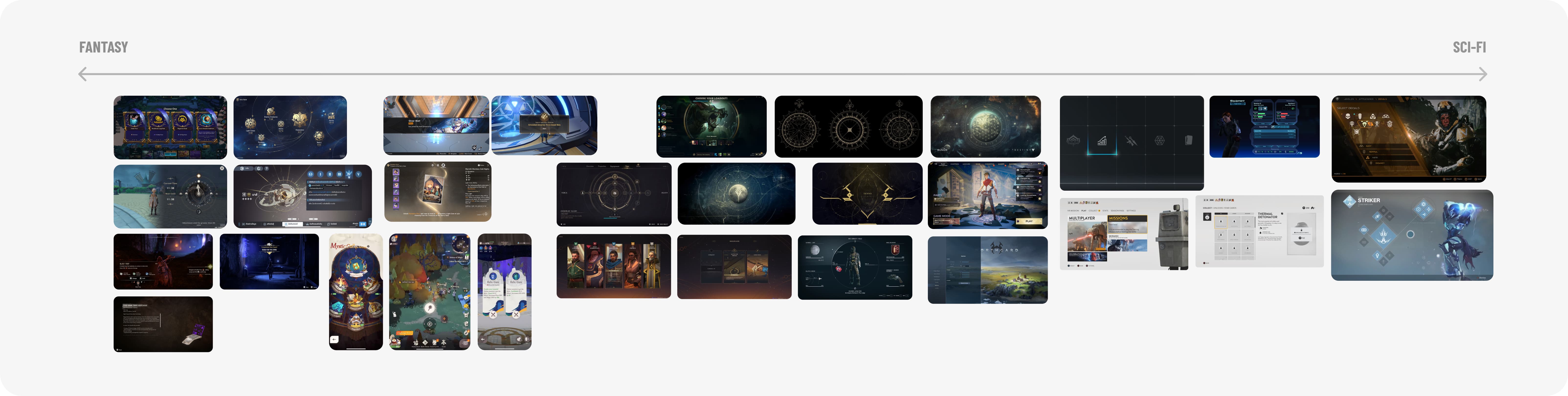
While we received a high-level direction from our stakeholders, the creative challenge lay in interpreting a very specific visual balance—the UI needed to sit between fantasy and sci-fi without leaning too heavily in either direction. It had to capture the essence of both worlds while maintaining a cohesive, game-like interface that still felt like an application. To tackle this, we began by curating mood boards and visual references, exploring a range of stylistic approaches that could embody this hybrid tone. This exploration helped us define a visual style that aligned with the narrative and thematic goals of the product, while ensuring usability and visual clarity across all components.
Design system setup, oversight, and maintenance
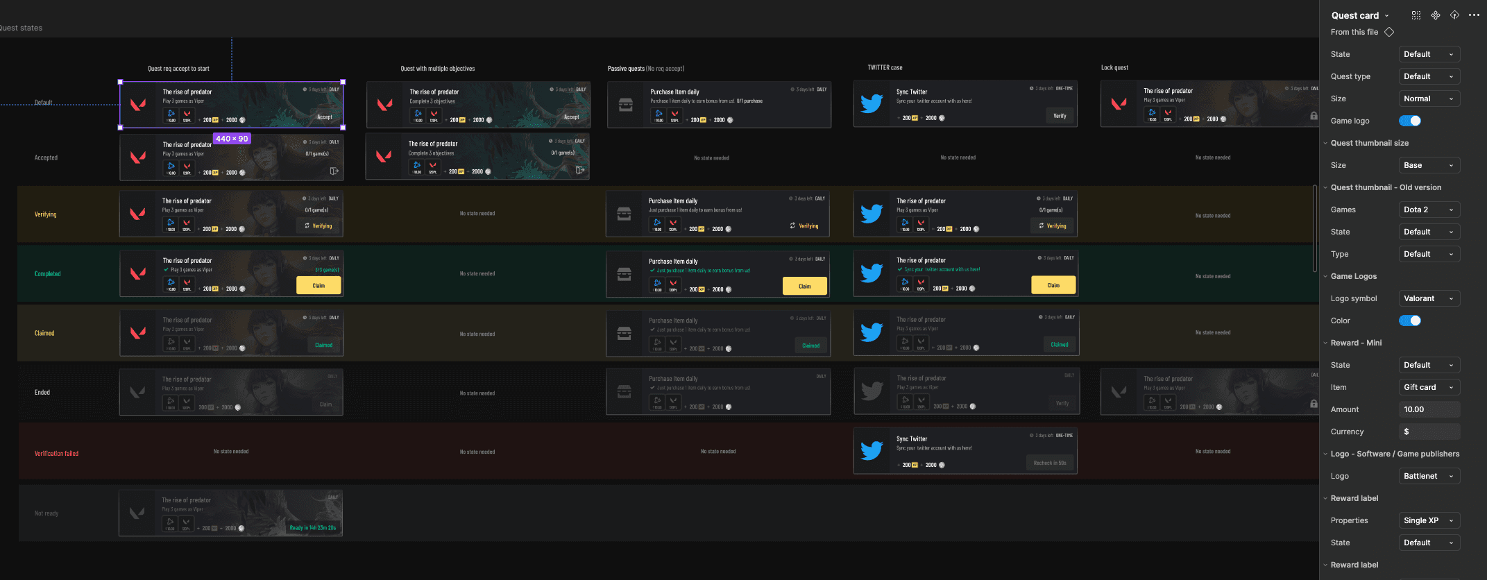
I worked closely with my design team to ensure that the system was scalable and adaptable as we continued to develop new features. One of the key challenges was ensuring the design system was easy to implement and utilize across the team, while also maintaining its flexibility for future growth. Balancing the ongoing work on new features with the upkeep and expansion of the design system required careful planning, but it was essential to support a cohesive and efficient design process across the platform.
Game Quests through Iconography Design
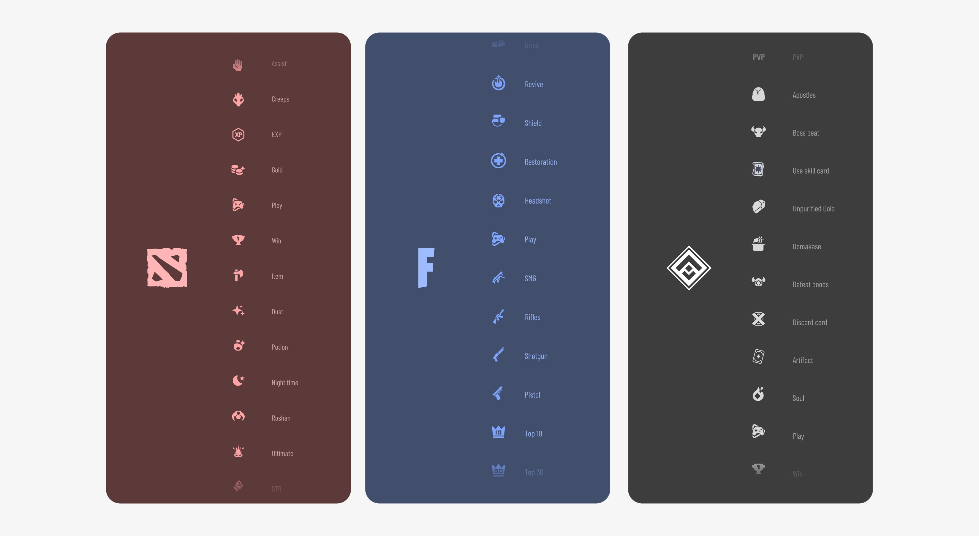
One of the key features I led the team to work on at Radiant was personalizing the game quests for our users. We developed a design system that used custom icons to represent different game subjects. These icons helped make the quest objectives clearer and easier to understand, allowing players to quickly identify what they needed to do. By giving each quest a unique symbol, we not only made it more engaging for users but also improved how they interacted with their daily tasks. This approach made the entire process of picking and completing quests much more intuitive and enjoyable.
While the personalized icon system was a major success, it did come with its challenges. As we partnered with new games or added extra content to existing ones, we needed to continuously design and incorporate new icons to keep the system relevant and functional. This meant that as the number of games and content grew, the design team had to stay agile, ensuring that every new addition was properly represented by a unique and intuitive icon. While this added to the workload, it was necessary to maintain the quality and consistency of the user experience across the platform.
Designing UI assets
The UI assets were one of the most enjoyable parts of designing Radiant. Since we collaborated closely with the Art team, we were able to work together on the visual aspects from the start. Once the concept art was finalized, we took their elements and refined them further on the vector side to ensure they fit seamlessly into the app. We worked on a variety of assets—from shop merch items and card designs (which we created in 3D) to icons in both high-detail and simplified styles. For example, some art assets were too complex to be clearly visible at smaller sizes within the UI, so we adapted and simplified those elements to make them more functional while maintaining their original feel.