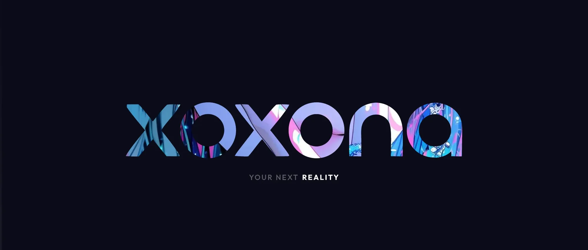
Leading the brand from zero
Xoxona is my latest project, and I'm taking design lead across both the branding and the product design approach. The identity starts with the primary lockup — a superellipse mark paired with the Outfit wordmark — built with a proper construction grid, clearspace rules and a stacked variant for tight spaces, so the brand holds up anywhere from the webapp to social.
The O-slots — a living logotype
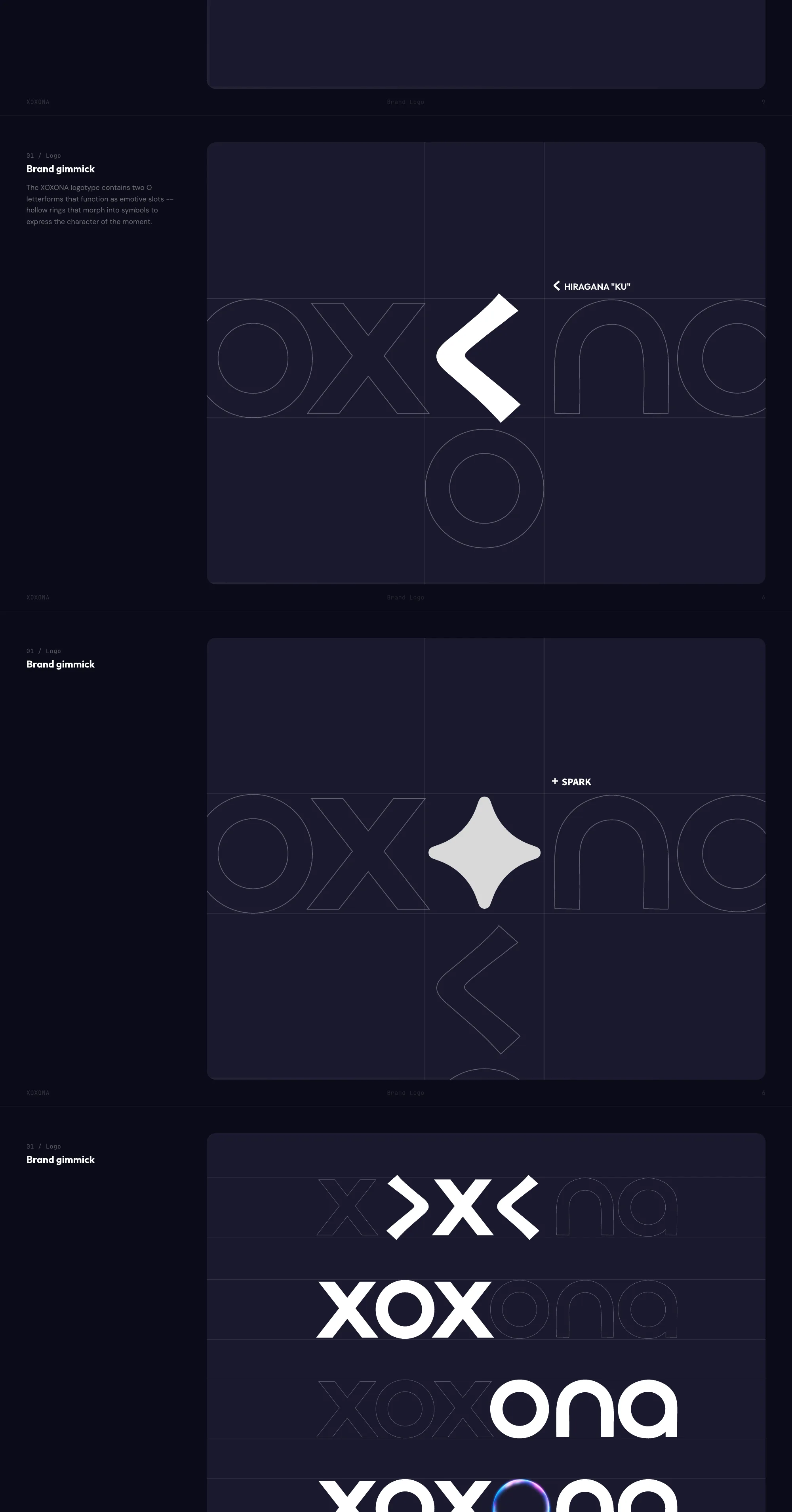
The logotype's signature gimmick: the two O letterforms are emotive slots — hollow rings that morph into symbols to express the character of the moment, from a hiragana く to a spark. It turns the wordmark into a living surface the product can play with, and it's the same idea behind the video-through-the-logo treatment on this portfolio's Xoxona card.
Dark-native, purple-first
The palette is dark-native — the product lives in the dark, and the colors are tuned for it. Purple is the emotional signature of the brand: it means "I'm here, I'm listening." Blue and pink support it, meeting in a gradient that carries the hero moments.
Manga-title energy
Outfit is Xoxona's voice — the Black Italic weight gives headings a forward-leaning, manga-title energy. DM Sans handles forms and onboarding, JetBrains Mono covers metadata, and the system extends to Thai. A full type hierarchy runs from hero headings down to captions: italic energy at the top, readable weight at the bottom.
Product design approach
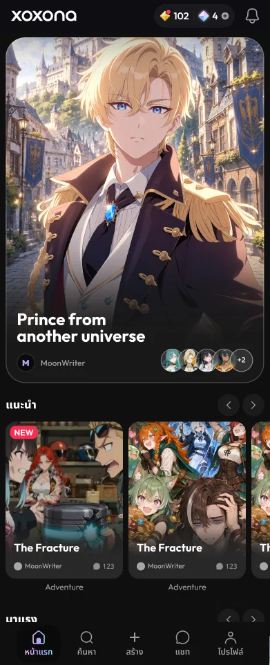
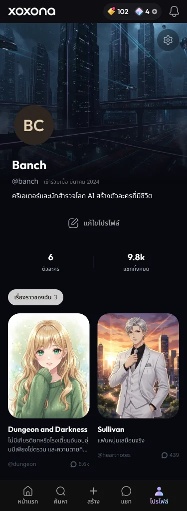
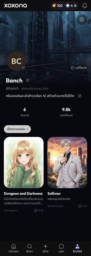
The brand system isn't a poster — it's the operating system of the product. The dark-native palette, the O-slot motifs and the Outfit/DM Sans hierarchy carry straight into the webapp's UI, from the storyline cards to onboarding. As design lead I own that thread end to end: defining the identity, translating it into a design language, and steering the product design so every shipped screen still feels unmistakably Xoxona.
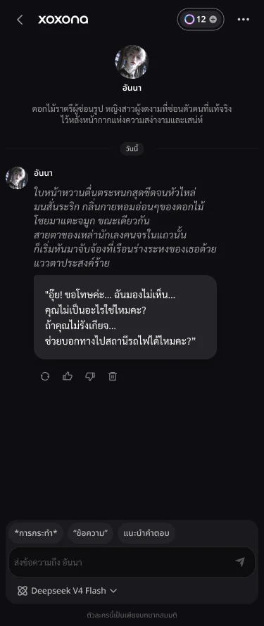
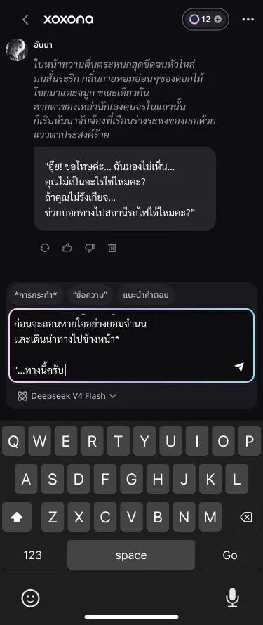
Design → live, checked continuously
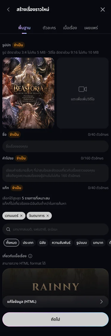
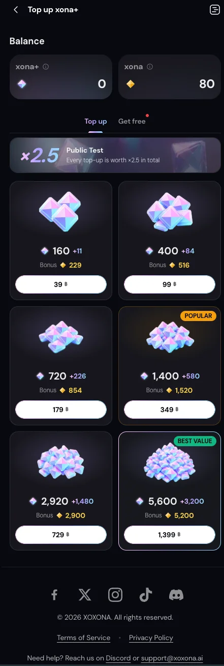
Every surface ships against pinned Figma frames — the creation flow's step-by-step forms, the publish gate, and the profile all have canonical designs that an automated design-vs-live QA loop compares against production nightly, flagging drift down to a missing control or a changed label. These are some of the pinned frames straight from the design file:
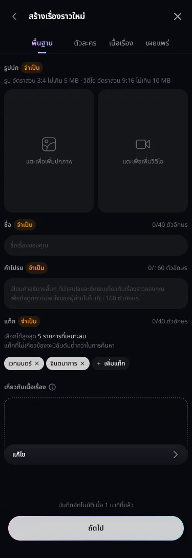
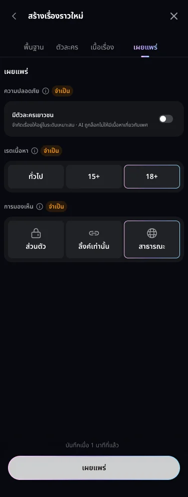
Prebuilding the app with Claude
Before the UI design phase started, I prebuilt the desktop app as working HTML with Claude — a full first version with the light/dark theme system, the Outfit + Noto Sans Thai type pairing, the chip and card language, skeleton loading, search and browse patterns. Instead of handing the designer a static moodboard, they got a living, clickable reference that already encodes the high-level design approach — and every discussion after that happened against something real.
The way I manage this is by treating the system prompt as a design document. The product's positioning, competitive references (what to learn from each, what to avoid), audience and design principles live as markdown context files that both the team and Claude read — so every Claude-assisted build, from prototypes to the nightly design-vs-live QA loop above, starts from the same brief instead of a fresh guess.
The logo transition — built with Claude, step by step
The whole intro sequence lives in a single HTML file, built in a back-and-forth with Claude: describe the motion in plain language, get a running build, tune the numbers, repeat. This is roughly how the conversation went.
PROMPT 01 — THE RING
Single HTML file. A particle plasma ring spins where the
second O of the wordmark will land — a canvas noise field
with dust particles orbiting it. I'll be testing thickness
variations, so expose every visual property as a parameter.
WHAT CAME BACK — EVERY KNOB IS A PARAMETER
// Ultra thickness (fixed)
const TP = {
  bandW: 78,          // plasma band width
  bloomOuter: 130,    // outer glow stroke
  bloomInner: 70,
  coreLine: 8,        // conic-gradient core ring
  particleSpread: 0.72,
  atmosGlow: 1.6,
};
Because every visual property is a named parameter, iterating meant editing one number — not re-prompting. The ring itself is a per-pixel simplex-noise field sampled inside the band, with ~1,700 orbiting particles layered on top.
PROMPT 02 — THE REVEAL
When the lockup settles, swap in a dark cover with the
logotype cut out of it and start the hero video behind —
the footage should live inside the letters. Then fade the
cover away to reveal the full scene.
THE MASK TRICK — AN INVERTED LOGO CUTOUT
// two mask layers: the logo + a full-bleed rectangle
maskEl.style.maskImage =
  `url("${logoSvg}"), linear-gradient(#000, #000)`;
maskEl.style.maskComposite = 'exclude';
// subtracting one layer from the other turns the
// wordmark into a window onto the video behind it
PROMPT 03 — THE CAMERA
Don't slide the logo sideways. Open zoomed in on the O;
once the letters have landed, zoom the camera out and pan
at the same time so the lockup ends perfectly centered.
ONE TRANSFORM, ONE EASE
logo.style.transformOrigin = `${oX}px ${oY}px`; // pivot on the O
logo.style.transform = 'scale(1.5)';            // opening shot

// the pull-back: pan + zoom share a single ease
logo.style.transform =
  `translateX(${slideOffsetX}px) scale(1)`;
Six phases — ring, O landing, letter stagger, camera pull-back, mask swap, reveal — all tuned live in the file running below.
Xoxona is live in beta and evolving fast — this case study grows with it.